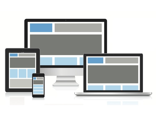
Responsive Website Design
Meet the next best thing to happen in website development, responsive web design. Say goodbye to paying for multiple templates to suit every different screen size and operating systems from smartphones to PC’s and say hello to just ONE adaptive design that works for all growing technology. Now why wouldn’t you want a website that works equally well across thousands of different screens?
But what is responsive web design? Keep in mind that it’s not just about the “look” but about the effectiveness of the user experience as well. Probably the most devices on demand are the smartphones, growing more and more common every year. Ever find it hard to read information on a website while having to zoom in the screen, slide back and forth, push the tiny little links on your phone but accidently hitting a different one? It’s all so frustrating right? This is what responsive design addresses head on.
Mobile-optimised sites are known to improve a company’s online presence (thanks to the smartphone). Keeping the most important aspects of a website, such as easy navigation and readable information on products, services, etc., will definitely grant you positive feedback and returning customers. As well as being able to keep the same familiar design; just one obvious change to the site: a resizable display!
The layout of your website will adjust itself to comfortably fit its current display on any device. If you are reading this article on the Inology website, try resizing the browser and see what happens! If not, take a look at the screen shots below taken at different widths…
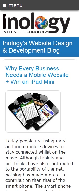 |
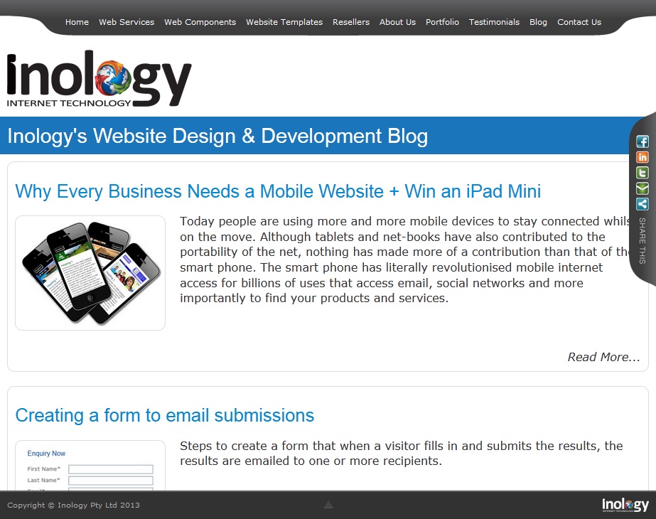 |
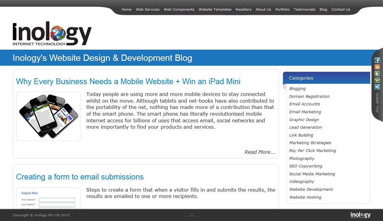 |
|
Why waste any more time and possible customers? Call us today for a quote on an adaptive website for your business before you lose potential customers using mobile phones!