Tips for Web Content Layout
Web design is the presentation of a company's content and marketing message in the best and most appropriate format. So, it is critical to give adequate time to designing the content layout of the website.
Here are a few tips that will help you guide your web developer on an effective content layout for your website.
Arrange content logically
The content on any website can be broken down to five main categories – branding, navigation, primary content, supplementary content and site information.
Before designing the content layout, make sure that your content for each category is available. This will prevent you needing to create space for certain content at the last moment, which would defeat the entire content layout process.
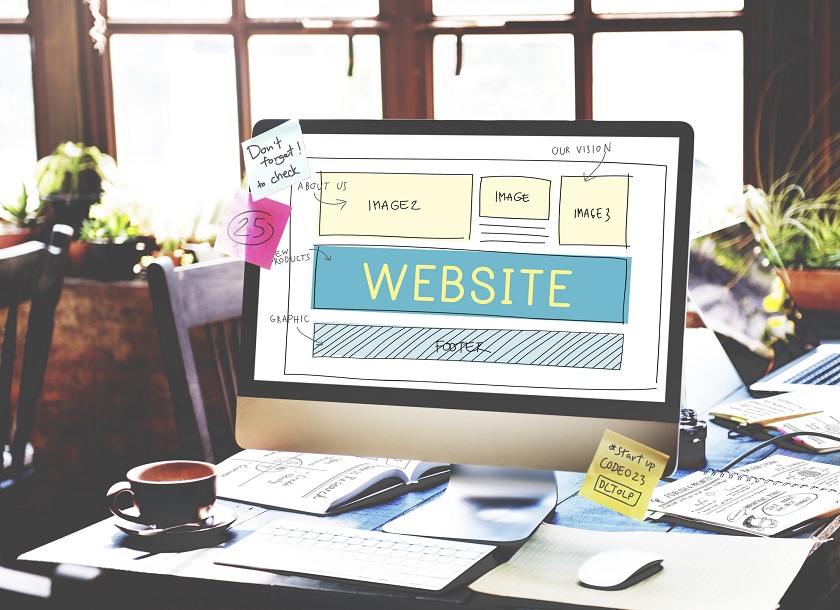
Wireframes
This is perhaps the most important aspect while designing your content layout. Wireframes are basically sketches of each page of the website. They illustrate the layout of the content, the navigation buttons/features and the functionality of the web page.
Wireframes are generally black-and-white sketches. Colours and images are mostly kept out at this stage to reduce distractions. You get a clear idea of how the web page will look and how each element on the page, especially the content, will be placed.
Grids
Breaking down the web page into grids, using a combination of vertical and horizontal blocks and white gutter spaces that run down the sides, helps in structuring the layout creatively.
Grids provide designers with a guide on placement of objects on the page, which includes the content. The design process stays structured and follows a rhythm, which is an essential part of content layout. Using the grid format creates web pages that are easy to navigate from the perspective of the end user. Content, and all other elements, are better organised.
Another great benefit of developing your web layout with grids is its ability to respond to the device on which your website is being viewed. This is called responsive design and by setting up your layout using a fluid grid you will ensure that the information being presented on the site is easily accessible on devices of all sizes. This is hugely important as smartphone and tablet use continues to increase.
Whitespace
In any design, and even photography, utilisation of whitespace is often the difference between good, bad and ugly. Whitespace is also referred to as negative space. Prudent use of whitespace can transform a good layout to a great layout. This design technique uses blank spaces to highlight certain sections of the webpage. It also prevents the content layout from getting cluttered. End users can concentrate on one segment of content and not get distracted by something else right beside it.
Content flow
Content flow is not the flow of the language, but the flow of the layout design. The visitor should be guided to the next set of content, in the most simple manner, without any explicit instructions. The plan is to ensure that every piece of content on the site gets noticed and draws attention. Use of colour, the colour theme, choice of typography, size of elements (fonts, buttons and so on) and the images on the website ensure that the content flows effectively.
Following these tips for content layout will ensure that visitors will be guided to the right content, easily and effectively. Hiring the services of a company offering content layout and optimisation is the best way of ensuring that your content reaches your audience effectively.
To talk to an expert in content layout and web design Contact Us Here.